GAMESQ Law Firm

Strategy & Design
Project overview
Attorney Garrick McFadden serves as Arizona's only Black-owned law firm founder. He focuses on personal injury law, working with black and other marginalized communities that often face systemic bias in the legal system.
A smiling man talking on the phone wearing a hat with the GAMESQ "G" logo in orange
Garrick McFadden needed a brand that exemplified his strategy, focus, and determination. As a black attorney and law firm owner, he wanted imagery that spoke to his audience and didn't back down from shared identity.

We needed to create a visual identity that was clean, professional, and didn't back down.

The driving issue
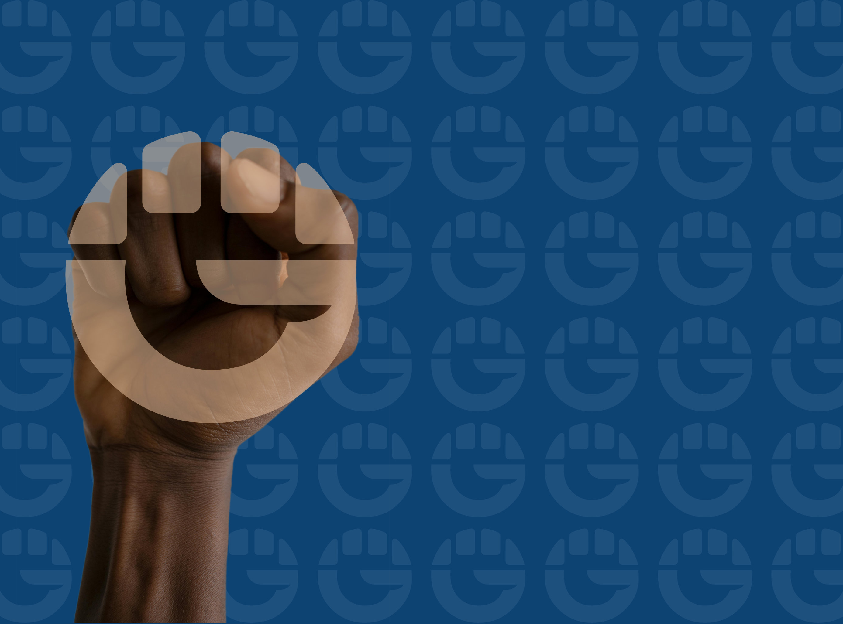
The GAMESQ "G" mark overlaid on a raised fist on a blue background, with the "G" mark repeated faintly in the background
In discovery meetings, we examined simplified word marks and complex, heroic brand marks. We decided that the hero symbolism wasn't the right fit for the brand, detaching the firm from the cause of the clients. However, the raised fist has been a symbol of power and unity for decades, spanning civil rights and labor movements. It symbolizes the power of numbers and working together.  
The insight
A style mockup of different photos together in a grid with orange and blue color overlays and the GAMESQ logo
The design of incorporating the "G" with the raised fist came naturally; the symbolism fitting together perfectly with the firm's name. Combined with a classic and powerful navy/orange color scheme, the brand identity quickly came together around the letter mark.

According to Attorney McFadden, it had "captured the essence of our mission."
The solution